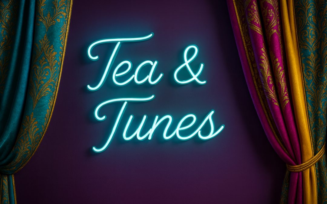
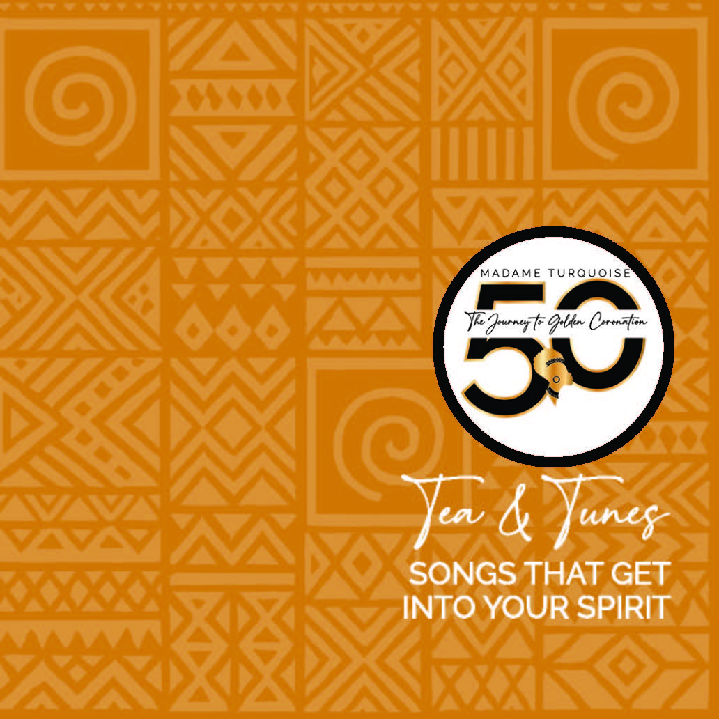
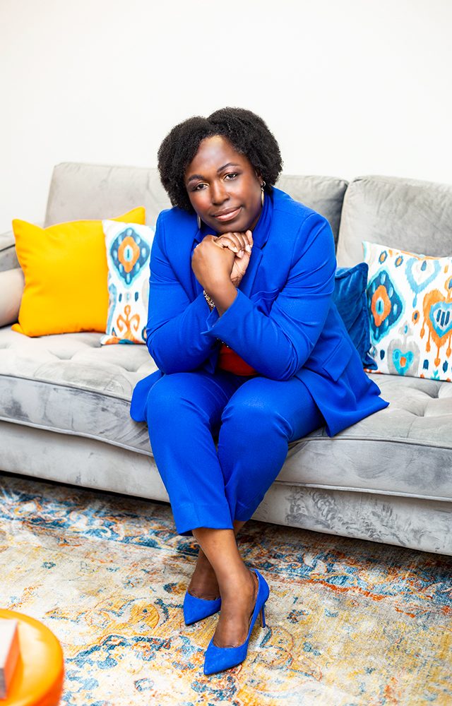
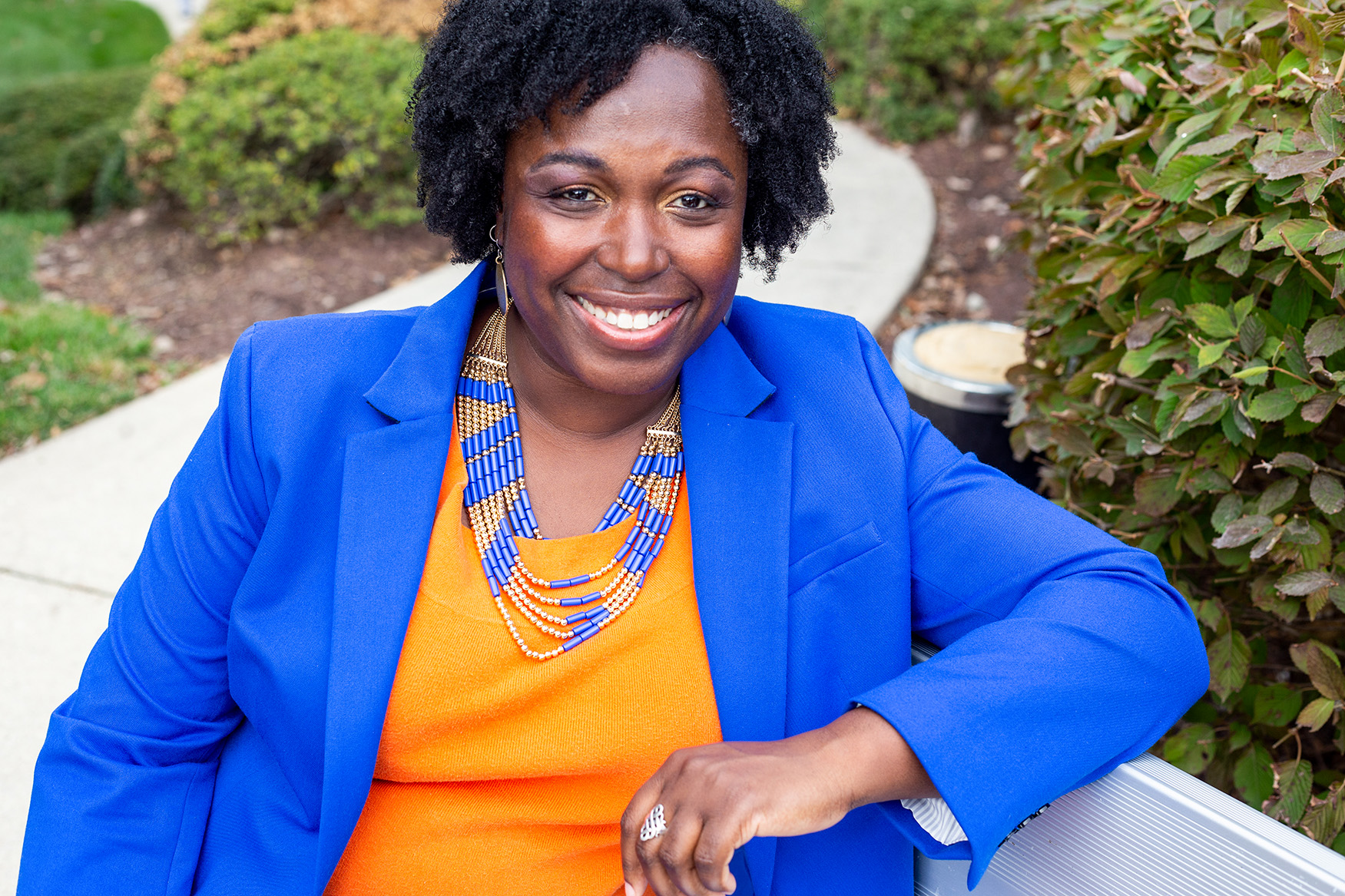
Tea & Tunes

Tea & Tunes

Client: ARTfrohemia

Project: Tea & Tunes – Event Concept, Brand Experience & Launch (2025)

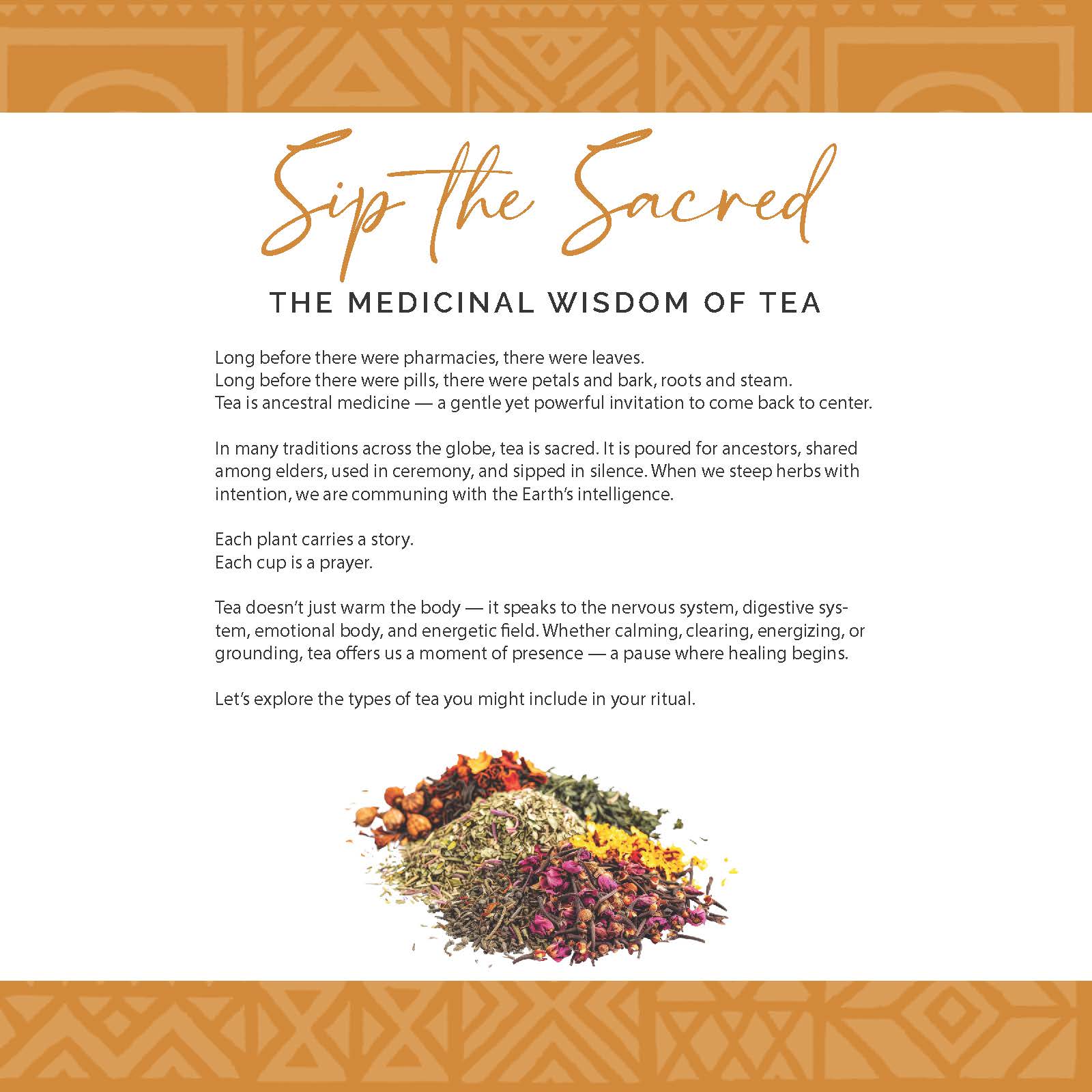
Tea & Tunes is a signature ARTfrohemia event production blending the healing ritual of tea with the transformative power of music. It debuted in August 2025 as part of The Golden Era — my milestone 50th year celebration project — serving as both a soft launch for this immersive experience and an introduction to my tea-based healing offerings.

While its first gathering was integrated into The Golden Era festivities, Tea & Tunes stands as an ongoing ARTfrohemia experience designed to bring people together in sacred, sensory-rich connection. The event offers participants a curated journey of taste, sound, and spirit that nourishes creativity and deepens community bonds.

The Challenge

The goal was to create an event experience that:

  • Embodied ARTfrohemia’s sacred, colorful, and culturally rooted aesthetic.

  • Seamlessly integrated tea as plant medicine with sound and vibration as healing tools.

  • Created a relaxed yet intentional environment where guests felt nourished, inspired, and energetically uplifted.

  • Served as both a personal milestone celebration and a branded experience that could live beyond The Golden Era.


The Approach

  1. Brand Experience Design

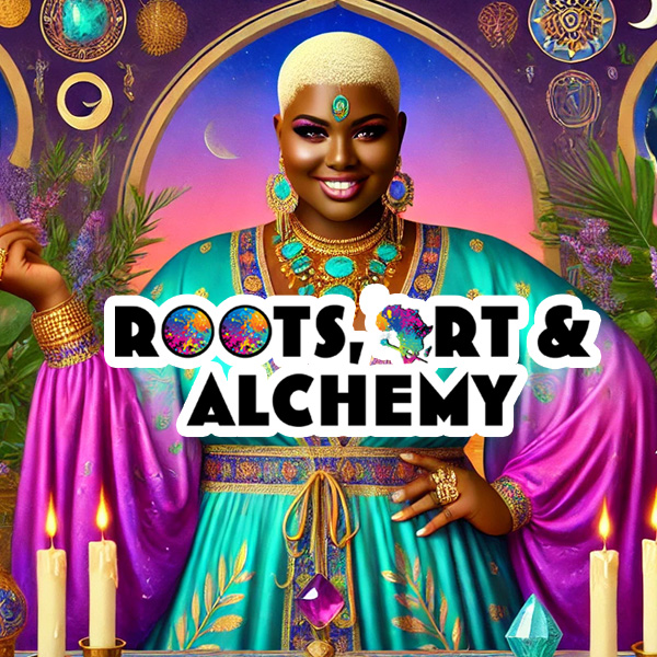
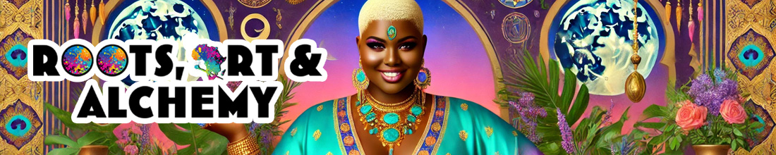
    • Created the Tea & Tunes logo and visual identity in ARTfrohemia’s core palette (turquoise, purple, fuchsia, gold).

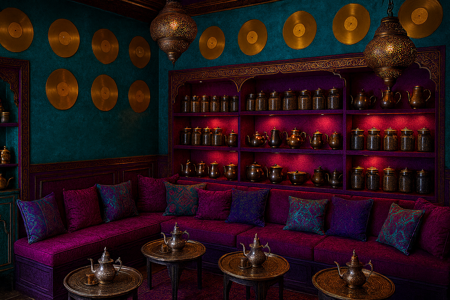
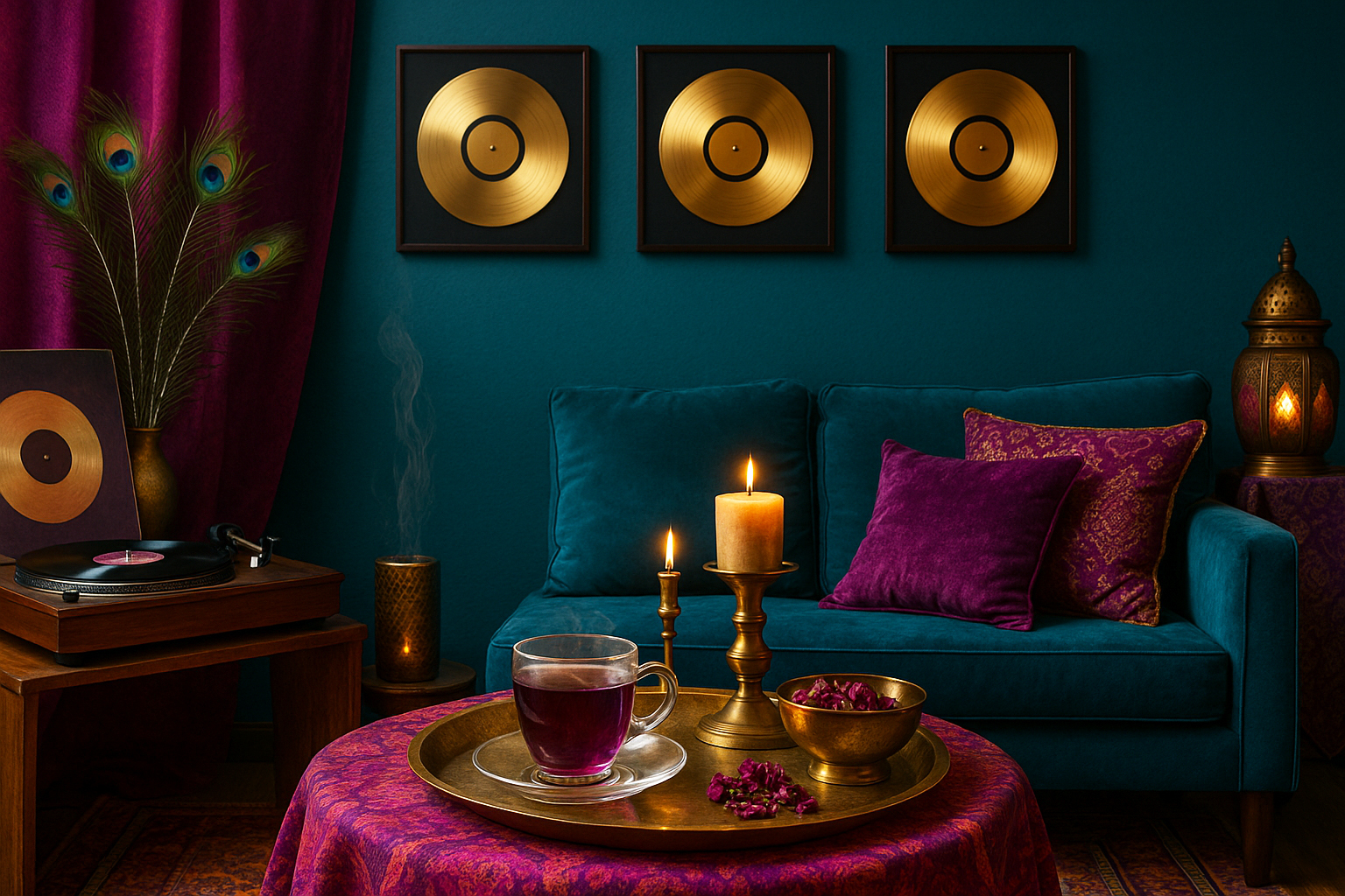
    • Designed branded event assets, including invitations, playlist covers, and a custom AI-generated virtual tea lounge background for participants to use during the gathering.

    • Styled the event space with Moroccan-inspired textiles, gold accents, and vibrant florals.

  2. Sensory Integration

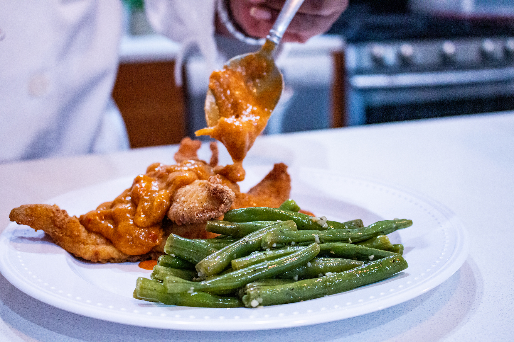
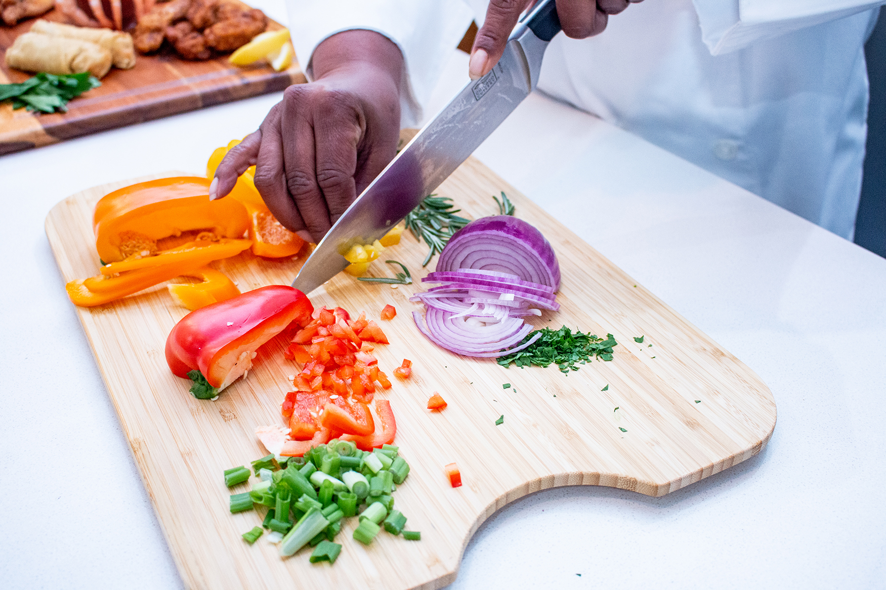
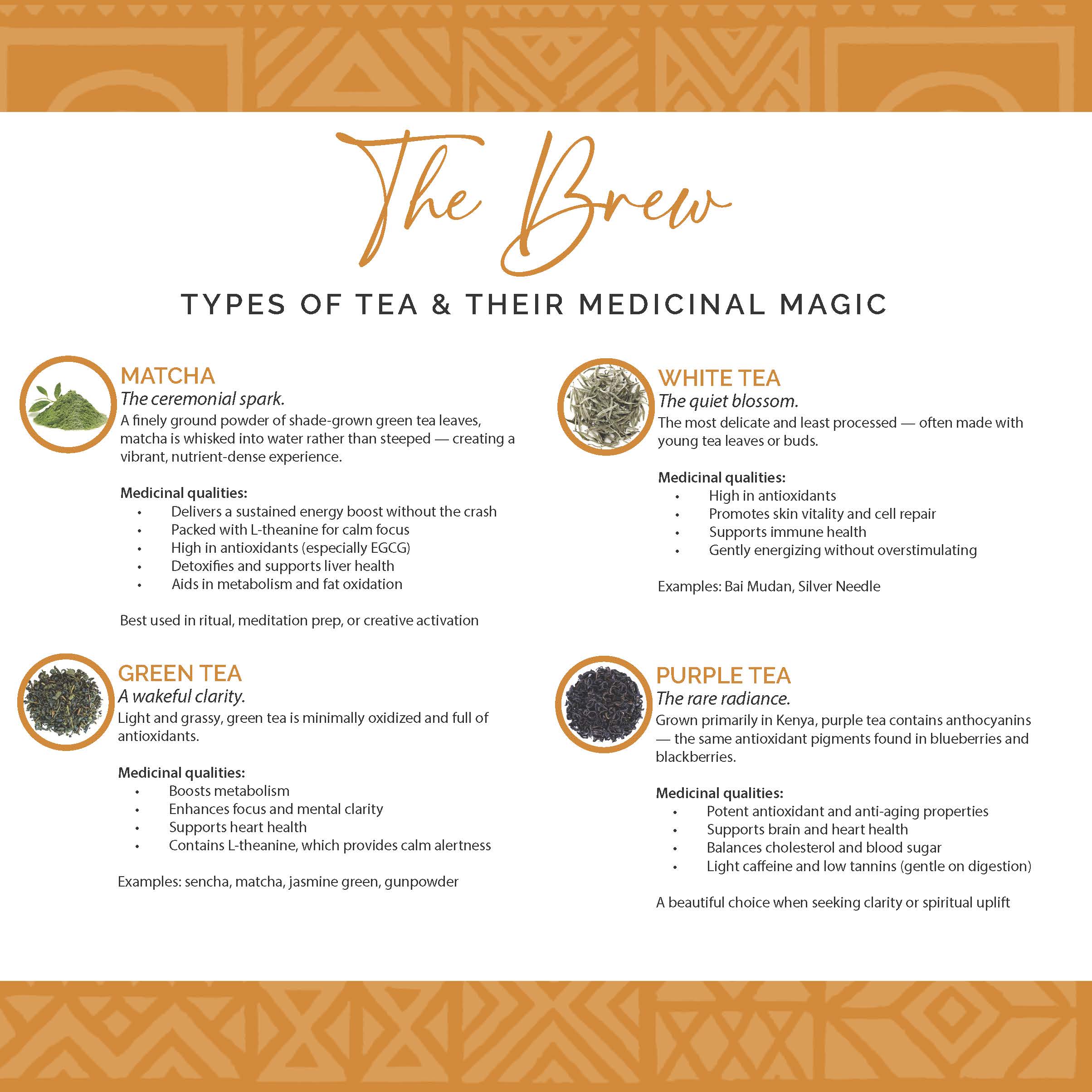
    • Curated a featured tea blend for each event — for the debut, Elephant Walk Purple Tea from Calabash Tea & Tonic.

    • Designed a “Sonic Sanctuary” playlist in the FlowerBomb style, blending soulful, global, and instrumental tracks.

    • Partnered with Roeatea Butler of Akili Wellness to lead a sound bath primer, deepening relaxation and energetic alignment.

  3. Audience Engagement & Keepsakes

    • Developed a conversational flow combining guided reflection, music sharing, and sensory immersion.

    • Produced and distributed a Tea & Tunes keepsake guidebook containing tea ritual instructions, playlist links, and reflection prompts.

    • Mailed the featured tea blend to attendees after the event as a post-gathering gift, allowing them to recreate the experience at home.


The Results

Tea & Tunes debuted as an intimate yet vibrant gathering that fully embodied the ARTfrohemia brand experience. Guests reported feeling “deeply relaxed,” “creatively inspired,” and “connected in a way I haven’t felt in a long time.”

The event’s success has positioned Tea & Tunes as:

  • A recurring ARTfrohemia offering within the Embodied Wellness & Energy Activation and Spiritual & Metaphysical Guidance pathways.

  • A signature example of my ability to merge event design, sensory branding, and cultural storytelling.

  • A bridge between personal celebration (The Golden Era) and professional creative-healing work.

Roots, Art & Alchemy

Roots, Art & Alchemy

Client: ARTfrohemia

Project: Roots, Art & Alchemy – Media Brand Creation & Launch Strategy (2025)

Roots, Art & Alchemy is the storytelling and cultural conversation arm of ARTfrohemia, the creative and spiritual consultancy I founded. This media platform was conceived to expand ARTfrohemia’s mission into podcasting, cultural commentary, and sacred dialogue — offering a space where art, ancestry, and activism intersect.

As the Sacral Chakra Visioneer and host of Roots, Art & Alchemy, I developed the brand identity, visual aesthetic, launch strategy, and content framework to position the platform as a source of inspiration, education, and guidance for creatives, cultural leaders, and spirit-led seekers.

The Challenge

I needed to create a media brand that:

  • Clearly aligned with ARTfrohemia’s purpose and voice while having its own unique identity.

  • Visually communicated vibrancy, cultural richness, and sacred intention.

  • Had the flexibility to host diverse formats, including podcast episodes, essays, photography, and live events.

  • Built a foundation for future speaking engagements and public appearances.


The Approach

  1. Brand Identity & Visual Design

    • Designed a vibrant, culturally inspired visual palette rooted in ARTfrohemia’s core colors.

    • Developed the Roots, Art & Alchemy logo and digital assets for use on the website, social media, and Substack.

    • Created branded templates for podcast covers, post graphics, and promotional materials.

  2. Content Architecture

    • Established a thematic framework for episodes and articles, built around “Sacred Conversations in Rhythm & Resistance.”

    • Crafted core messaging to position the platform as a guide-led space for creative liberation and cultural preservation.

  3. Launch Strategy

    • Planned the August 2025 soft launch to align with ARTfrohemia’s main brand launch for maximum synergy.

    • Designed cross-promotional flow between ARTfrohemia.com, Roots, Art & Alchemy’s Substack, and my personal site.

    • Created a visual and editorial calendar for the first three months of content.


The Results

Roots, Art & Alchemy now stands as a vibrant media voice for ARTfrohemia, with a distinct identity that draws in creatives, cultural workers, and spiritual seekers. The platform’s design and content strategy have:

  • Established a recognizable brand aesthetic and voice.

  • Built a foundation for audience growth through Substack subscriptions and cross-promotion with ARTfrohemia services.

  • Positioned me, Madame Turquoise, as a guide in both creative and cultural conversations — setting the stage for future speaking and event opportunities.

Chef Kerrell

Chef Kerrell

Client: Chef Kerrell Nevels

Project: Logo Refresh & Brand Photography (2021)

Chef Kerrell Nevels, is a culinary artist known for the delicious fusion of her Louisiana roots paired with the urban flavors of the Washington Metropolitan Area, approached us to transform her logo as she transitioned from the established LA/DC Catering to her eponymous Chef Kerrell brand. The goal was to create a fresh, modern identity that reflected her unique culinary style while also showcasing her expertise through high-quality brand photography.

The Challenge

Chef Kerrell wanted a brand that embodied her evolution as a chef, moving from catering to a more personal, dynamic identity. This required:

  • Reimagining her logo to focus on her individuality and culinary artistry.
  • Designing professional photography to highlight her skills, ingredients, and signature dishes in a vibrant and authentic way.
  • Ensuring the new brand reflected her warmth, creativity, and ability to craft unforgettable culinary experiences.


The Approach

  1. Logo Refresh:
    We collaborated closely with Chef Kerrell to develop a refined logo captured her essence of her former brand combining Lousiana and DC (LADC) together . Her new branding incorporates a simple contemporary design, clean typography and design elements that convey her.
  2. Brand Photography:
    We planned and executed a photography session to create a library of striking, professional images. The photos:
    • Showcase Chef Kerrel in action, demonstrating her precision and creativity.
    • Highlight her signature dishes with close-up, beautifully styled shots.


The Results

Chef Kerrell’s new brand, Chef Kerrell, is a reflection of her growth and artistry. The vibrant photography has elevated her online presence, providing her with dynamic content to showcase her talent on social media, her website, and marketing materials.

This refresh has positioned her to confidently engage with her audience as an individual chef and culinary artist, ready to make her mark on a broader scale.

Akili Wellness

Akili Wellness

imac-front

Client: Akili Wellness

Project: Logo Design, Brand Photography and Web Design (2019)

Akili Wellness, led by Roeathea Butler, a clinical social worker, is a holistic mental wellness firm specializing in supporting high achievers and entrepreneurs dealing with anxiety and stress. The firm’s mission is to provide tools and strategies that empower clients to find balance and achieve optimal mental health. This project included the design and development of a logo, brand photography, and a website to establish a professional and approachable brand presence.

The Challenge

Akili Wellness needed a cohesive brand identity that would:

  • Communicate professionalism and warmth, balancing the firm’s clinical foundation with its holistic approach.
  • Appeal to its target audience of high achievers and entrepreneurs, reflecting their desire for clarity and calm.
  • Incorporate the signature colors—blue, orange, and gold—to evoke trust, energy, and empowerment.
  • Showcase Roeathea’s expertise and the firm’s services in a visually compelling and user-friendly way.


The Approach

Logo Design:
We crafted a clean and modern logo that reflects the essence of Akili Wellness:

    • Blue: Represents calmness, trust, and stability.
    • Orange: Conveys energy, warmth, and motivation.
    • Gold: Adds a touch of luxury and success, appealing to high-achieving clients.
    • The design includes a circular motif symbolizing wholeness and balance, a core tenet of Akili Wellness’s philosophy.

Brand Photography:
We conducted a professional photoshoot to capture images that reflect the firm’s welcoming and empowering approach. The photography highlights:

    • Roeathea Butler in both professional and approachable settings to convey expertise and relatability.
    • Holistic elements like calming workspaces, natural materials, and subtle wellness cues to align with the brand ethos.
    • Dynamic shots to create versatile imagery for use across the website, social media, and marketing materials.

Web Design:
The website design for Akili Wellness features:

    • A Clean Layout: Streamlined navigation and intuitive structure to ensure ease of use.
    • Visual Storytelling: Large banners and vibrant imagery that reflect the brand’s holistic and uplifting mission.
    • Service Descriptions: Clear and compelling content that outlines services and benefits for high achievers and entrepreneurs.
    • Interactive Elements: A contact form and scheduling features to facilitate seamless client engagement.
    • Responsive Design: Mobile-friendly formatting to ensure accessibility for users on any device.


The Results

The branding project provided Akili Wellness with a polished, cohesive identity that resonates with its target audience. The logo, brand photography, and website work in harmony to position Akili Wellness as a trusted partner in mental wellness for high achievers.

The firm’s online presence communicates professionalism, warmth, and clarity, creating a platform for growth and connection with clients.

Eleganz by Design

Eleganz by Design

imac-front

Client: Eleganz by Design

Project: Logo Design, Brand Photography and Web Design (2018)

Eleganz by Design, LLC, led by designer Cathy Thompson, is a full-service interior design firm specializing in concierge services and turn-key design solutions. Cathy approached us to create a cohesive visual identity that encapsulates her brand’s elegance and expertise while showcasing the firm’s stunning work. The project included logo design, brand photography, and a sophisticated website design.

The Challenge

Eleganz by Design needed a brand identity and digital presence that reflected its hallmark qualities: elegance, professionalism, and seamless service. Key objectives included:

  • Crafting a logo that visually communicates the concept of “turn-key” design in an elegant and modern way.
  • Capturing professional images of interiors designed by the firm to highlight their attention to detail and aesthetic sensibilities.
  • Designing a website to showcase the firm’s services and portfolio while providing an effortless user experience for prospective clients.


The Approach

  1. Logo Design:
    We designed a sleek, timeless logo that embodies the “turn-key” concept central to Eleganz by Design’s services. The logo features:

    • Refined typography with clean lines to convey sophistication.
    • A subtle key graphic integrated into the design, symbolizing seamless access and complete solutions.
    • A minimalist color palette that complements the brand’s high-end aesthetic.
  2. Brand Photography:
    We conducted multiple photoshoots of interior spaces designed by Eleganz by Design. The goal was to capture the artistry and attention to detail that define the firm’s work. These photos:

    • Highlight the luxurious, functional designs across residential and commercial spaces.
    • Emphasize textures, finishes, and spatial harmony to demonstrate Cathy Thompson’s expertise.
    • Provide versatile content for use across the website, social media, and marketing materials.
  3. Web Design:
    The eleganzbydesign.com website was designed to be a digital reflection of the firm’s elegance and professionalism. Key features include:

    • Portfolio Showcase: A visually stunning gallery that highlights the firm’s completed projects.
    • Services Overview: Clear, concise descriptions of concierge and turn-key design offerings.
    • Client Testimonials: A section dedicated to glowing feedback from satisfied clients.
    • A responsive design to ensure optimal user experience across devices.


The Results

The comprehensive rebranding project positioned Eleganz by Design as a leader in full-service interior design. The logo, photography, and website work together to communicate the firm’s sophisticated approach and exceptional craftsmanship.

The website now serves as an elegant platform for Cathy Thompson and her team to attract high-end clientele while showcasing the transformative power of their design solutions.